Typography - Exercise
28/03/2022 - 1/06/2022 (Week 1 -Week4)
Feng weijie | 0349058
Typography | B' in Creative Media
Lectures
Week 1 - Introduction & Briefing
During the first week of the lecture, we met with Mr. Vinod, the friendly lecturer. First, he introduced us to the platforms we used in this module, such as Facebook Group, Google Drive for storing documents and Google Sheet for checking attendance.
Then, Mr. Vinod briefed us on the module information. He also shared helpful tutorial videos from Youtube on how to set up our digital portfolio in Blogger, and pre-recorded lectures to learn more details about typography. We were told the importance of updating the E-portfolio on a weekly or daily basis to document the progress of each design. Also, it was helpful to see our predecessors' sample electronic portfolios as a guide.
Week 2 -
This week's recorded lectures are about the development and timeline of typography in the various years of the human age
Early Alphabet Development: Phoenician to Roman
The Greeks changed the direction of writing called "boustrophedon" (how the ox plows the field). This is a left-to-right, then right-to-left form of writing. Not only did they change the reading direction, they changed the direction.
Figure 1.0 Booustrophedon, March 29, 2021
In addition, we learn about the handwritten letters of the early century, the square capitals and the village capitals. These are condensed versions of square capital letters that allow writing on parchment twice as much and less time. The pen or brush should be angled about 30 degrees from vertical. However, they are a bit difficult to read due to their compressibility.
Figure 1.1 Roman cursive, March 29, 2021
Week 3 -
basic letter form
In this recorded lecture, we looked at the letterform components section to make it easier to identify fonts.
Baseline: The base dashed line in letter form.
-Median: x-height dashed line in letter form.
-X-height: The height of the font (lowercase).
-Hat Height: The dotted line at the top of the alphabet.
-Rise Height: The line where rod travel reaches above cap height. (optical adjustment)
-Drop Height: Lowercase the line of the bottom stem.
A line that defines the basic letter form is called a stroke.
Figure 1.2 description letter form. April 11, 2021
The fonts:
· Uppercase - Capital letters + certain accented vowels, c cedilla & n tilde, and a/e & o/e ligatures.
· Lowercase - Lowercase letters that include the same character set as Uppercase.
· Small Capitals - Uppercase letterforms drawn to the x-height, the same size as lowercase but in the form of uppercase
· Uppercase Numerals (Lining figures) - Same height as uppercase letters, with same kerning width.
· Lowercase Numerals (Old style figures) -Height is with ascender and descender, most commonly found in Serif typefaces.
Week 4 -
Text/ Indicating Paragraphs
Pilcrow - An archaic way of indicating paragraphs from medieval manuscripts
Line space(leading*) ensures cross alignment across columns of text. Most commonly used today. Lines must cross-align
Figure 1.3 Line Spacing vs Leading
Figure 1.4 Standard Indentation
Figure 1.5Extended Paragraphs
Window - short line of type left alone at the end of the column of text
Orphans - short line of type left at start of column
These should be avoided whenever possible, especially in justified text. Widows are the type of short lines left alone at the end of a column of text that can be resolved by re-wrapping the entire paragraph. For orphans, short lines left alone at the beginning of new columns may require care. We can make adjustments, such as moving columns or reducing row lengths in the layout.
Figure 1.6Window & Orphan -
Instructions
Task 1 -Type Expression
Week 1
We were told to list the words for action in the chat box, and the lecture picked a few of them and posted them to the Typography Facebook group as a poll. Each of us would love to take part in this mini-activity. After voting, we need to choose 4 of the 16 words to express their meaning using any suitable font provided. The word list is: Cough (Mandatory), Squeeze, Pop, Explode, Grow, Decay, Crumble, Faint, Cure, Build, Walk, Sound, Quiet, Rob, Hover, Wink. This task requires us to think creatively and visualize The word to produce a good visual impact.
Figure 1.0 Word poll in Typography Facebook Group March 28, 2022
Figure 1.1 Fonts from Google Drive, March 28, 2022
Before I started sketching out these ideas, I did some research on what each word meant. I scoured Pinterest for some references to get some ideas.
Figure 1.2 Letter design reference from Pinterest, March 29, 2021
Week 2
I start by doing a rough sketch of the selected word on the iPad.
Figure 1.3 Text Expression Sketch.jpg, March 29, 2021
After feedback was given, we were asked to digitalize our sketches on illustrator.
We uploaded the final version in the Facebook group. Mr. Vinod reviewed my type expression and gave feedback. "wink" is not well designed, it didn't pass the test
Figure 1.4 Four selected digitized words. April 11, 2021
Four selected digitized words. pdf
After the feedback session, we were asked to take a word of our choice and make a GIF.
For the animation, I decided to choose the word "cough" because I think it's the best expression of all my genres
Figure 1.5 First attempt at an animation frame for the word "Cough". April 11, 2021
Figure 1.6 "Cough" gif effect . April 11, 2021
We were asked to present in "indesign". We step through the given exercises in pre-recorded tutorials under the guidance of Mr. Vinod. We had to use the ten fonts we requested to download earlier. With video teaching, I can learn more about these tools and their capabilities while doing this exercise.
Figure 1.6 Comparison of kerning and tracking, April 11, 2022
Figure 1.6 First exercise- name with different typefaces. April 11, 2022
Task 1 - Helvetica Type Formatting
I learned how to edit the layout by adjusting the appropriate point size, paragraph spacing, and text leading. To make the text cleaner and more visually appealing, we can turn off hyphenation and make appropriate adjustments to kerning, tracking, and leading. This reduces text clutter and how images are placed in the layout.
Figure 1.7 Text formatting layout design. April 18, 2022
Figure 1.8 Text formatting layout design. pdf April 18, 2022
Font : Univers LT Std
Typeface : Gill Sans Light Italic
Font size : 51 pt, 11 pt, 9 pt
Paragraph Spacing: 12pt
Average characters per line : 50 ~ 56
Margins : 3p (top, left, right), 10p (bottom)
TASK 2 : TYPOGRAPHIC EXPLORATION & COMMUNICATION
Feedback
Week 1
Throughout the e-portfolio setup process, you need to ensure that the link provided is a directional guide to the typography page.
Week 2
Some words are not explored enough. Not much to do, some words could be better
How accurate must be art will be to your steps. For most of my designs, I include graphic elements that the typography doesn't need. For one of my pop sketches, there wasn't enough to explore the word, and a wrong sketch was made. Digitization is challenging. The words I have designed have shapes that are difficult to implement in the typeface given by Mr. Vinod, which may be a bit difficult for me.
Week 3
Overall, my digital words are generally average.
Mr. Vinod analyzed my digital expression, but there are still many problems. The expression of the word "wink" did not pass the test and needs to be improved.
Week 4
Overall e-file is good .The overall electronic profile is not bad. Ready for final submission in week 5, including 4 final type expressions digitized, 1 animated GIF of selected words, and 1 final layout in text format
reflection:
Experience: Typography class is fun for me, although we can't take classes face to face. The lectures are very friendly and the modules are well built. It made me a little anxious by looking at the schedule and the tasks we had to complete. It's very fun but challenging. I hope I can cope with the upcoming practice. I appreciate my lectures and peer feedback to improve my designs. Through these few weeks, I have learned a lot about words and fonts and how to express them in terms of design. It's been an exciting journey.
Further reading
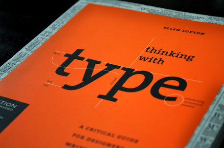
Thinking with type by Ellen Lupton 2004
This book is a gentle but practical introduction to why typography is important and why people should care about it. It contains many font images designed in various ways and is combined with descriptive text to demonstrate various typographic principles.
In addition to explaining how to do things properly, Lupton provides many useful examples of what not to do.
The book is divided into three parts: letters, text, and grids. Each section begins with an overview of the category, including its definition and history, and is then divided into several smaller sections about a particular subcategory.


.jpg)
.jpg)
Comments
Post a Comment