Typography - Exercise2
Typography - Exercise2
4/05/2022 - 18/05/2022 (Week 1 -Week4)
Feng weijie | 0349058
Typography | B' in Creative Media

lecture
Week 5-Typography Task 2 Progress Demo
https://youtu.be/rPwYO3ff4e0
In the lecture video, Mr. Vinod explains the short process of drawing thumbnails and then digitizing and expressing them effectively in Adobe Illustrator. Then export the thumbnail and use 1 of the 3 provided articles as the body. Then apply the text formatting mentioned earlier and then apply in the same way in this task.
Week 6 - Letters and Understanding Letter Forms
The font is asymmetrical
Uppercase letters may imply symmetry but not symmetry. The obvious difference is the stroke thickness, and the less obvious difference is the curvature of the font. Each bracket that connects the serif to the stem has a unique arc. The following illustration shows the equally symmetrical Universals. Look closely, the slope on the left is thinner than on the right. Designers need to pay attention to the harmony and personality expression of the font.

Figure 1.0 Analyzing baskerville and Univers' capital "A"
By examining two seemingly lowercase "as", the complexity of each individual letter form is subtly demonstrated. When designing a font/font, it is important to copy the uniqueness of the font feature: start with one feature

Figure 1.2 Analyzing the lowercase letter "a" from Helvetica and Univers
Instructions
He says that the dimensions used to make thumbnails in Illustrator should be 200mm X 200mm, and Indesign's pages should have the same dimensions.
I'll make a thumbnail in Illustrator and then export it to InDesign, where I'll text format the article of my choice, which is the second option, "Follow the code." The 3 reasons I chose that article were because at the beginning, the title had direct information, and after reading the article, I thought the second one was the most interesting.
TASK 2 : TYPOGRAPHIC EXPLORATION & COMMUNICATION
I selected Edit Text option 2 -“Follow The Code.”
Inspiration map of my choice for pinterest

Figure 1.0 Inspiration for Pinterest

Figure 1.1 Inspiration for Pinterest
Before that, I didn't do a good job of studying the meaning of the font in the exercise. So this time I was thinking carefully. "follow" has the meaning of go, so I think of it as a person, the word "the" is stepped on by it, and then the word "code" is its shadow.
I create digitally in Adobe Illustrator as specified by Mr. Vinod.
Font used - Source Code Variable
Dimensions - 200 X 200 mm

Figure 1.2 Thumbnails (Title)
I was happy with the final drawing, so I used it as my thumbnail

Precautions
- Font size (8–12)
- Line length (55–65/50–60 characters)
- Text leading (2, 2.5, 3 dots larger than font size)
- Ragging (left aligned)/Rivers (left aligned)
- Cross alignment
- No widows/orphans
Font used - Univers LT Std 55 Roman
Font size - 9 points
Lead - 11 points
number of characters per text column - between 55-65 characters,
The spacing between paragraphs is also set to 11 pts and automatically converts to 3.881mm.

Figure 1.4 Screen scraping of the number of characters.
As suggested in previous lectures, keep it in the range of 55-65 characters per line.
I'm going to do grid alignment before I start designing typography

Figure 1.5 Baseline grid before alignment

Figure 1.6 After the baseline grid is aligned

Figure 1.7 Using the Rectangle Tool to Show the Form/Structure of Text Formatting
The first feedback, Vinods said my idea was fun. It's that there is a problem with the proportions, and the paper is too big. So I readjusted the ratio.

Figure 1.8 Final Design Task 2 PDF
feedback
Week 5
General feedback-Much work still needed in formatting the eportfolio. Nevertheless the major elements needed are present.
Specific Feedback-The design is interesting. Mr. Vinod suggested to me - the typography height is too high and needs to be reduced. I have problems with the letter spacing of my subtitles, so I have to be careful when I use abbreviated fonts.
Week 6:
General Feedback - Submitted text must be in PDF and JPEG export (high quality). Screenshots are not accepted.
Specific feedback - The title design is interesting, the body is good, and the line spacing and jagged are uneven. In addition, the leading text is OK, but you can consider using other fonts, different thicknesses.
Week 7
Independent Study week
reflection:
Experience: I personally found this exercise to be more challenging than the previous exercise because of the more text to process. We also need to express headings and consider the integration of body text.
Observation: It’s so much fun to have a large group of classes where everyone learns from each other about typography. Through Mr. Viond's observation and critique of students' work, we can improve our vision and thinking. Also, I'm impressed with the creativity of everyone who is able to think outside the box on a given topic and create designs in a variety of styles.
Discovery: Before starting the design process, I realized the importance of doing good research and reference. It has helped me improve my understanding of the meaning of texts and translate them into my own designs. Taking the time to read and research additional material has also broadened my knowledge and inspired new ones.
Further reading
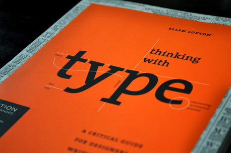
Thinking with type by Ellen Lupton 2004
Here's what I came up with from further reading
Letter:
Different fonts are designed to print in different sizes. For example, fonts with large x heights and thicker stroke thicknesses that are relatively uniform works well at small sizes.
Mix different fonts should only be used if there are significant differences between them.
Text:
"Although many books define typography as improving the readability of written text, in reality, one of the most user-friendly features of design is to help readers avoid reading."
.jpg)
.jpg)
Comments
Post a Comment